
ilseS
-
Posts
149 -
Joined
-
Last visited
-
Days Won
3
Content Type
Forums
Gallery
Blogs
Events
Store
Downloads
Profiles
Posts posted by ilseS
-
-
One year later ...same issue. I have tried everything
-
On 11/20/2020 at 3:19 AM, tuanphan said:
Add to Home > Design > Custom CSS
/* blog font */
.blog-basic-grid--text * {
    font-family: 'NEUTRA' !important;
}
/* pagination */
h2.item-pagination-title {
    font-family: 'NEUTRA' !important;
}
/* Shop list font */
.products.collection-content-wrapper .grid-item * {
    font-family: 'NEUTRA' !important;
}
section.products.collection-content-wrapper * {
    font-family: 'NEUTRA' !important;
}
Hi Tuan,
I used this font to target the title font on a grid layout blog, and it worked, thank you, however it also changed the meta font ...any suggestions? Thank you!
/* blog grid view font */.blog-basic-grid--text * {font-family: conso extra-light !important;} -
@paul2009 I realised what the issue is ...Buttons start out the same in CE and FE, but, if I adjust the vertical padding -as I often do because I find the buttons a bit clunky, it seems they don't render equally in FE and CE. Perhaps to do with cell height? So a button at 0.9em vertical padding looks great in a CE section, but significantly bigger in a FE section, unless I adjust cell padding ...which of course affects everything else.
-
Im experiencing other issues. Meaning a primary button (or any other) in FE with same styling, no matter how I fit/fill etc, is still bigger (or smaller) than a primary button in a CE section. ...maybe its me 😒 If I completely change the row height, I can get the vertical padding of the buttons to be the same, but without a lot of tweaking, same buttons look obviously different.
-
I've been experimenting with mixing -everything @paul2009 said. Also, little things like buttons cannot be made to match, no matter the sizing in settings, they just render differently in FE.
These little details really bother my thing for symmetry and consistency (and of course the BIG details like spacing) -
On 11/11/2022 at 1:31 AM, tuanphan said:
I think you should use a normal image, then we will use CSS to make curve on top left top right corners.
I did an example with image at bottom of page'

div#block-efff2a01b90cc35816e9 .image-block-wrapper {
    border: 1px solid #d1a556;
    padding: 10px;
    border-top-left-radius: 300px;
    border-top-right-radius: 300px;
}
div#block-efff2a01b90cc35816e9 img {
    border-top-left-radius: 300px;
    border-top-right-radius: 300px;
}
This is fantastic @tuanphan I've been going round and round trying to give a border to image shapes that don't end up a square around an oval -impossible! This is a great workaround. Many thanks for posting.
-
On 10/26/2022 at 10:28 PM, creedon said:
DOM elements are block based and the CSS border property address those blocks, so CSS border property can not do irregular shapes.
The shapes feature is achieved with SVG overlays. To add a border with custom code looks to be fairly tricky, if doable at all.
Many thanks for the reply -this is unfortunate, but at least it’s not just a reflection of my coding ineptitude 😅
-
9 hours ago, tuanphan said:
If you share link to a page where you use image shapes, we can check easier
Thank you Tuan, it was more a general Fluid Engine code question, I was experimenting with image shapes in FE yesterday and couldn’t get old code to work for shapes, all leave a square frame around the shape.
-
adding to this ...has anyone figured out how to create borders around image shapes in FE??
All of the old codes I used render a square border around the block, but not the image within the block, meaning if I have a round shape within an image block there is a square border ... -
On 10/1/2022 at 12:33 AM, verush said:
Hi. I was wondering if anyone could help me to increase the width of the fluid engine grid, so that the content goes from side to side. Thanks.
As of now, you can’t. I believe there is some CSS for this floating around, but there is no adjustment for grid width at the moment. You can drag a block completely out of the grid so it’s flush, but nothing in between)
-
1 hour ago, Rusticus said:
Is this feature coming back in the future? I for one really like the text to have no animation but the images to have an animation. Now this is not possible with Fluid Engine, I'm stuck with either/or.
And is it the same with Lightboxes? I can't seem to select a Lightbox for images, which is very usefull with smaller images.
Thank you.
Please post this question to customer support or tag Sarah or Guillermo -they wont see this here and wont register our voices/requests/complaints ... Lightbox for images is not something that should have been removed! (nor block specific animations)
-
On 9/11/2022 at 3:21 AM, chrisshaddock said:
Thanks @bangank36
That worked. Any idea how that hover effect started? Is there a change or bug with fluid engine?
Thanks
You may want to check your animation settings ...they now effect everything site-wide (whereas before we could have image animation, site animation, etc) ... I noticed some unwanted effects on my buttons depending on the animation style I chose ...
Would be really nice if they fixed this! -
On 11/8/2021 at 7:47 AM, tuanphan said:
Squarespace released an Accordion Block a few weeks ago.
Here are some useful code when you use the accordion block (Add to Design > Custom CSS)
#1. Change Dividers Color
/* accordion divider color */
.accordion-divider {
    color: #ff00ff !important;
}
#2. Change Arrows Color
/* accordion arrows color */
.accordion-block .arrow {
    border-color: #ffff00 !important;
}
#3. Add icons before Accordion Titles
/* Accordion icons before titles */
li.accordion-item .accordion-item__title:before {
    content: "";
    width: 20px;
    height: 20px;
    display: inline-block;
    background-repeat: no-repeat;
    background-size: contain;
    background-position: bottom center;
}
li.accordion-item:nth-child(1) .accordion-item__title:before {
    background-image: url(https://cdn.pixabay.com/photo/2021/11/02/15/30/tealights-6763542__340.jpg);
}
li.accordion-item:nth-child(2) .accordion-item__title:before {
    background-image: url(https://cdn.pixabay.com/photo/2019/10/23/06/30/hamburg-4570577__340.jpg);
}
li.accordion-item:nth-child(3) .accordion-item__title:before {
    background-image: url(https://cdn.pixabay.com/photo/2021/02/17/08/02/woman-6023442__340.jpg);
}
#4. Different Color for Accordion Titles
/* accordion title colors */
li.accordion-item:nth-child(1) .accordion-item__title {
    color: red;
}
li.accordion-item:nth-child(2) .accordion-item__title {
    color: blue;
}
li.accordion-item:nth-child(3) .accordion-item__title {
    color: violet;
}
#5. Change a specific word color in Accordion Content
First make it bold then use this CSS
/* accordion content specific word color */
.accordion-item__description strong {
    font-weight: normal;
    color: red;
}
#6. Accordion Title Background Color
/* accordion title background */
.sqs-block-accordion .accordion-item__title-wrapper {
    background-color: #32a4e6;
}
#7. Accordion Content Background
/* accordion content background */
.sqs-block-accordion .accordion-item__dropdown--open {
    background-color: #262853;
    color: white;
}
#8. Add Unordered List in Accordion Content
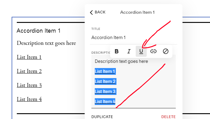
First, add some text then Underline them
Next, use this CSS
/* Accordion Content - Add Unordered list */
span[style*="text-decoration"]:before {
    content: "";
    display: inline-block;
    width: 3px;
    height: 3px;
    background-color: black;
    vertical-align: middle;
    margin-right: 3px;
}
span[style*="text-decoration"] {
    text-decoration: none !important;
}
#9. Accordion Titles – Add Line Break
If you use a Business Plan or higher, you can use another approach in this comment
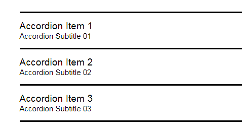
/* Accordion SubTitle */
li:nth-child(1) span.accordion-item__title:after {
    content: "Accordion Subtitle 01";
    display: block;
    font-size: 15px;
}
li:nth-child(2) span.accordion-item__title:after {
    content: "Accordion Subtitle 02";
    display: block;
    font-size: 15px;
}
li:nth-child(3) span.accordion-item__title:after {
    content: "Accordion Subtitle 03";
    display: block;
    font-size: 15px;
}
Result
#10. Accordion Title-Content Text Size on Mobile only
/* accordion title - content text size on mobile */
@media screen and (max-width:767px) {
/* accordion title */
span.accordion-item__title {
    font-size: 12px !important;
}
/* accordion content */
.accordion-item__description * {
    font-size: 10px !important;
}
}
#11. Simple Style 01
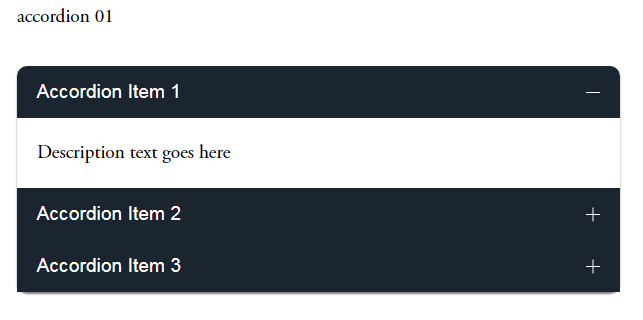
Add a Code Block under Accordion >> Use this code
<style>
/* accordion title color */
.accordion-item__title-wrapper {
    background-color: #1a252f;
    color: white;
    padding-left: 20px !important;
    padding-right: 20px !important;
}
.accordion-item__click-target {
    padding-top: 15px !important;
    padding-bottom: 15px !important;
}
/* make first item round corner */
li.accordion-item:first-child .accordion-item__title-wrapper {
    border-top-left-radius: 10px;
    border-top-right-radius: 10px;
}
/* make last item round corner */
li.accordion-item:last-child:not[data-is-open="true"] .accordion-item__title-wrapper {
    border-bottom-right-radius: 10px;
    border-bottom-left-radius: 10px;
}
/* remove divider between accordion items */
.accordion-divider {
    display: none;
}
/* accordion content padding */
.accordion-item__description {
    max-width: unset !important;
    padding: 20px !important;
}
/* arrows color */
.plus>div {
    color: white !important;
}
</style>
Coming soon.
#12. Accordion Content Link Style
/* Links underline */
div.accordion-item__description p a {
    border-bottom: 1px solid black;
}
/* Links font style */
div.accordion-item__description p a {
    color: red !important;
    font-size: 30px;
    font-family: monospace;
    letter-spacing: 2px;
}
#13. Add a button inside Accordion Content
First, you need to add a text link. Next, add this CSS to turn link to button
/* turn accordion link to button */ div.accordion-item__description p a { background-color: black; color: white !important; padding-left: 10px; padding-right: 10px; padding-top: 15px; padding-bottom: 15px; border-color: red; border-width: 1px; border-style: solid; }#14. Add an Image inside Accordion Content
Use this CSS to add image to top or bottom of accordion content
/* Add an image into Accordion Content */
/* replace demo image with your image url */
/* nth-child(1) is first accordion item, nth-child(2) is second item... */
/* :before is image on top, :after if image on bottom */
li:nth-child(1) .accordion-item__description:before {
    content: "";
    display: block;
    width: 100%; /* image width, you can also use px */
    height: 150px; /* image height */
    background-image: url(https://cdn.pixabay.com/photo/2021/09/15/15/48/seals-6627197__340.jpg);
    background-repeat: no-repeat;
    background-size: cover;
    margin-bottom: 20px; /* space between image-text */
}
#15. Change Plus/Minus (+/-) to custom icon
Replace demo image urls with your icon urls
/* Plus */
:not([data-is-open="true"]) .plus {
    background-image: url(https://cdn.pixabay.com/photo/2021/02/06/09/03/man-5987447__340.jpg) !important;
    background-size: contain;
    background-repeat: no-repeat;
}
:not([data-is-open="true"]) .plus div {
    display: none;
}
/* Minus */
[data-is-open="true"] .plus {
    background-image: url(https://cdn.pixabay.com/photo/2021/12/12/22/17/red-squirrel-6867105__480.jpg) !important;
    background-size: contain;
    background-repeat: no-repeat;
}
[data-is-open="true"] .plus div {
    display: none;
}
#16. Change style of a word on Accordion Title
See this comment
Wrote by @tuanphan
@tuanphan I'm trying to change the color of the entire title for a specific accordion block.
I need to do this with CSS rather than change the h4 color in site styles as I do NOT want to change the color site wide, only block by block. Could you possibly share code for this? Thank you!! -
@Chlobot Im also having an issue with this -playing with a workaround by placing a text block with background behind the photo.
Not ideal, but we do what we must 😉 -
The need is definitely not negated ...the image card layout options (with individual animation options which are now global in FE) make for clean,consistent, and and efficient design, they also allowed for some really great and unique CSS customization of those built in designs, which cannot be replicated in FE.
Many of us are really, really hoping they -and the customization options theirin, are brought back! @Guillermo_SQSP -
I'm having issues with background images showing on some sections and others not. No code being used, and am in Classic Editor. No difference whether its a jpg or PNG ...nothing shows on the page, though it when editing it shows an image has been uploaded ...
Its maddening!
-
On 8/24/2022 at 5:30 PM, AndyBridge said:
Is there any way to edit the mobile view without changing the desktop view?
You can change *some* things on mobile without changing desktop -meaning, you can rearrange and resize blocks. But if you change text alignment within a box, text size, color, or anything else that relates to content, it will appear on desktop as well.
-
-
On 8/10/2022 at 12:59 PM, Phobic78 said:
@paul2009 Thanks for the workaround, it has saved me for the time being!
But it seems crazy that they haven't addressed this before rolling out the update. I really hope they are sorting it as a priority.
@Phobic78So far there seems to be no indication of fixing/bringing this on to FE. The -text wrapping or "pull quotes" as SS describes it may not be flashy, but its a classic and needed feature. I've logged with customer service, perhaps if enough of us do they will take into consideration ...
-
On 8/9/2022 at 12:10 AM, Sydbat said:
I'm mostly just posting this so SS receives as much feedback as possible about how much this update sucks. I have never worked with something so buggy and temperamental before. Every time I make a change, I come back and it looks different. And trying to get the mobile site to look halfway decent takes way too much effort.
I've created some pages using FE that I wouldn't have been able to make using the old editor, but now I'm afraid if I switch back to the classic it'll be even more of a headache. Has anyone done this successfully?
@Sydbat it’s unlikely the people who need to will see it here. A formal ticket/complaint needs to be logged …they are taking notice of these.
-
11 hours ago, brandonhendrickson said:
Site URL: https://www.rochestertag.com/
So... I hate it — like, hate hate it, like can't use it without screaming curses... and I'm honestly confused as to why this isn't the dominant conversation topic in the SS community.
Can anyone shed light on this?
My experience: I've made oodles of sites in SS. I love(d) SS, and have been an enthusiastic evangelist.
When I started my newest site, I found out that I'm required to use FluidEngine. I wasn't excited about this — it promised a learning curve that I didn't want to take on in a busy month — but, whatever. Gotta roll with the punches.
My experience of FluidEngine so far has been nothing but woe. I have three questions for anyone who can share their experiences.
1. What's the benefit supposed to be, again?The primary benefit (to judge by all the videos I've watched on YouTube) is that now we can stack words on top of images. This is a neat feature that I do not need to use. So the primary improvement is, for me, no improvement.
(Am I wrong about this? Is there another, better feature that FluidEngine is supposed to give us?)
2. Now it's more complicated to make a page, right?Even if I were really good at using Fluid Engine (and... maybe I will be, someday? maybe I'll stick with SS?... maybe?), it seems like it would still be significantly more work to make a simple page.
I get the drift that the old philosophy of Squarespace ("Build it beautiful") was to limit the number of decisions we could make, to nudge our sites into elegance. (Wanted to complicate it? That's what CSS was for.)
Now it feels like they've flipped the philosophy — we're forced to make tons of decisions just to put up something simple.
(Am I wrong about this?)
3. It's hard to get the spacing to work on mobile, right? Like... REALLY hard, right?I loved — loved — how effortlessly my sites used to appear in mobile. There were times I had to wrestle with it, but they were rare, and only when I was trying to do something weird.
But now — please, please tell me if you have a different experience — the spacing for mobile is really hard to work out! Like, IMPOSSIBLE to work out.
I didn't trust my judgment of this until I saw this video by Will Myers. His solution (a code injection, some custom CSS, and some juggling) is ingenious — and should not be necessary to ensure a site looks good on a phone.
(It's telling that, during his explanation, he struggles to make it work. Check out 7:20 — "This is something you need to be careful of, because I don't think Squarespace really likes you doing this, it wants to just force the extra space for some reason, I'm not really too sure why.")
(God, am I wrong about this? Please tell me I'm wrong about this. Whenever I try to imagine the folks at Squarespace — who have up to now been such fastidious designers — saying, "ah, screw spacing, nobody cares about spacing!" my mind explodes.)
Is anyone else being driven flipping insane by this?
And does anyone know if there's a way to opt out of Fluid Design, even if for the near-term future?
Not wrong 🤯
-
I would also love to find a workaround for this which allows for individual image block animations while bypassing the now only site-wide option
-
Sadly yes. A bit give with one hand take with the other IMO. Gone is the beautiful and automatic mobile scaling across all screen sizes. Replaced by required mobile re-design but without the tools to do so effectively. CSS still needed to hide blocks, change text etc.
And the tablet issue …
-


Remove padding from gallery block
in Site Design & Styles
Posted
Im having the exact same issue, same block configuration did the code above work? Thank you!