
thefakedaniel
-
Posts
20 -
Joined
-
Last visited
Content Type
Forums
Gallery
Blogs
Events
Store
Downloads
Profiles
Posts posted by thefakedaniel
-
-
On 5/1/2022 at 10:00 AM, tuanphan said:
Try this CSS
@media screen and (max-width:767px) {
.user-items-list-banner-slideshow[data-card-horizontal-position="left"] .slide {
    justify-content: center !important;
    align-items: center !important;
}
}
Yep, this is it, thank you!
-
Site URL: https://bonjrmusic.com
Hello,
How can I avoid the white bar that appears while I resize the window?
https://i.gyazo.com/c601d704708a402d0ce68d9d5bd70269.mp4
Appreciate any help I can get with this! -
On 4/22/2022 at 3:29 PM, tuanphan said:
Try it again. Recently SS has a bug so CSS won't work on editing mode.
Ah, perfect it worked!
And how about the actual boxes, how could I center those?
Example: -
On 4/18/2022 at 1:17 PM, tuanphan said:
Center on mobile only?
Add to Design > Custom CSS
@media screen and (max-width:767px) {
.user-items-list-banner-slideshow[data-button-alignment="left"] .list-item-content__button-container {
    text-align: center;
}
}
If you want center on all devices, edit 767px to 9999px
Hi, thanks for replying.
This doesn't seem to have worked, and also I am referring to the whole box, not just the text. I have already been able to center the text myself ;o -
Site URL: https://bonjrmusic.com/store-select
Hi,
I have a new issue that I've never had before where the CSS is working on the live website but not on the "custom css" page when I'm configuring the website.Custom CSS Page:
Live:How should I go about solving this issue?
Appreciate any help I can get!
Thanks,
Daniel -
3 hours ago, bangank36 said:
Try adding to Home > Design > Custom Css
#block-yui_3_17_2_1_1648729481274_4469 + div > .col:not(.span-0) {
  display: flex;
  justify-content: center;
  align-items: center;
  width: 20% !important;
}
#block-yui_3_17_2_1_1648729481274_4469 + div {
  display: flex;
  flex-wrap: wrap;
  justify-content: space-between;
}

@media only screen and (max-width: 1203px) {
  #block-yui_3_17_2_1_1648729481274_4469 + div > .col:not(.span-0) {
    width: 100% !important;
  }
}
My codes will arrange these buttons into one column if you resize the width of your browser.
Let me know how it works on your site
Thanks,
I just tried it out and here is the behavior I am seeing:
https://i.gyazo.com/7f5ac9282d56d4ccbeb819d125f65d13.mp4
Still a bit of overlap before it snaps into the column, not sure if that's what you intended. -
On 4/12/2022 at 6:17 AM, Web_Solutions said:
This option is not currently available in Squarespace
Gotcha, thanks!
If you're looking to help out some more, I have two other posts I made recently with no replies yet 😉
All the best!
Daniel -
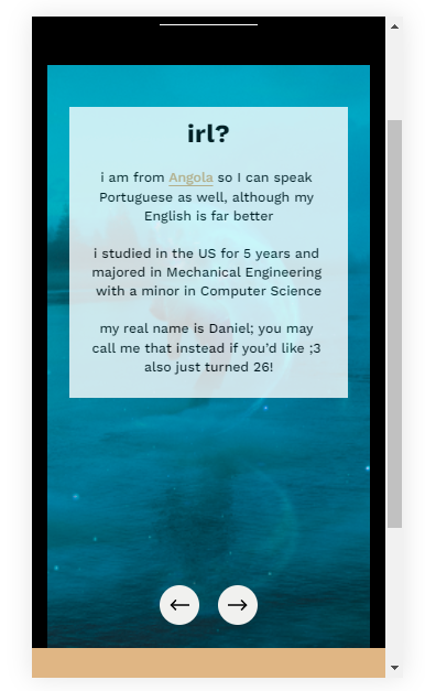
Site URL: https://bonjrmusic.com/faq
Hi,
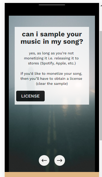
How do I center the button element ("license" & "stream" buttons) here using css?
Also, how can I ensure that each slide's box (the outer transparent box that contains title, description, button) is always centered? i.e. the left image the box is almost centered and the right image the box is more to the top
For context, I believe this is a slideshow section
I would also like to vertically center the slideshow navigation buttons that were previously placed at the bottom in the images above & space them apart so that they're attached to the edge of the screen. In the desktop version it's the offset parameter so I was already able to achieve this, however I have not been able to find the equivalent setting for mobile. Attaching a screenshot below of what I have been able to achieve so far, which is not much considering the buttons are not centered with the background and the spacing is not correct.
And if possible, I'd like to also change the navigation button radius. I was successful in doing this on the desktop version of the page.
Thanks in advance!
Daniel -
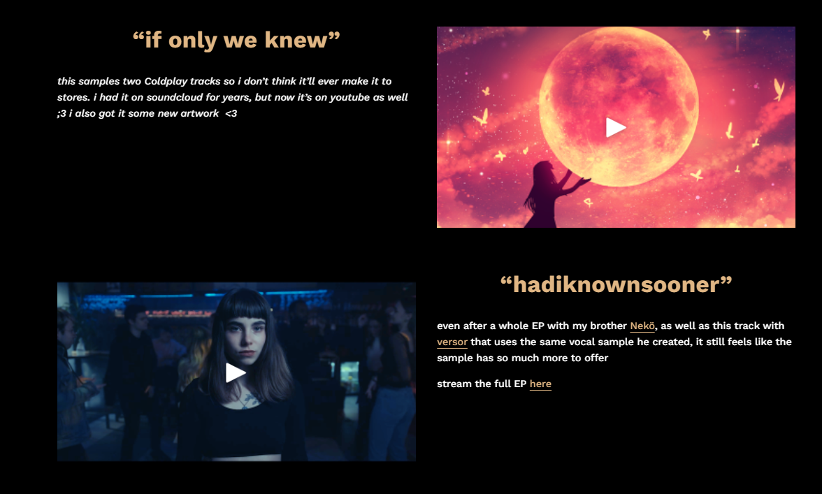
Site URL: https://bonjrmusic.com/music
Hello,
I have 4 buttons in a single row on the website page linked. However, when I resize the window, some of the buttons end up overlapping. How does one prevent this behavior?
I'm also noticing the header links ('home', 'music', 'videos', etc.) become two rows as the window size gets smaller. Looking around at other websites, it seems that they maintain a single row and adjust according to the window size by either having the links remain fixed (which i'm actually seeing with the squarespace forum header), scaling down (youtube) or trimming the content (soundcloud). Does anyone know the code for each of these three different approaches so I could test it out?
Appreciate any help I can get!
Thanks,
Daniel -
1 hour ago, Web_Solutions said:
I have update the code. I have marked that. Please add this then the caption will be exact center.
Perfect, it's working great. I just marked your post as the solution.
Do you have any suggestions on how to move content from one page to another without having to remake it? i.e. if I wanted to move the carousel I have on the 'home' page somewhere else, what would be the easiest way to do so?
But other than this question, thanks for helping me out with everything! -
Ok so turns out the padding is actually useless because the text position appears to depend on the window/screen size:
Full-screen
Windowed
Mobile
-
2 hours ago, Web_Solutions said:
Sure
Awesome, it worked.
Although I think the text isn't exactly centered:
This and I'm currently looking at the code to see where I can change the font size, hopefully I can find it.
Update: I found where I can change the font size. And also added some padding to move the text more to the center... not sure why it wasn't centered for me in the first place.padding-left:70px; -
8 hours ago, Web_Solutions said:
Please see the video. You can try this way
[data-section-id=""] { .gallery-grid-item{ overflow: hidden; position: relative; .gallery-grid-image-link:before { content: ""; position: absolute; top: 0; left: 0; bottom: 0; right: 0; z-index: 999; } img{ -webkit-filter: grayscale(80%); -moz-filter: grayscale(80%); -ms-filter: grayscale(80%); -o-filter: grayscale(80%); transition-duration: .7s; } .gallery-caption{ opacity: 0; position: absolute !important; top: 0; left: 0; right: 0; bottom: 0; display: flex; align-items: center; justify-content: center; transition-delay: 100ms; .gallery-caption-wrapper{ width: 80% !important; height: auto !important; p{ color: #fff !important; font-family: Work Sans; font-weight: 700; font-style: normal; letter-spacing: .01em; text-transform: none; text-align: center; line-height: 1.032; font-size: calc((4.5 - 1) * 1.2vw + 1rem); } } } } .gallery-grid-item:hover { img{ -webkit-filter: grayscale(0%); -moz-filter: grayscale(0%); -ms-filter: grayscale(0%); -o-filter: grayscale(0%); transform: scale(1.13); } .gallery-caption{ opacity: 1; } } @media(max-width: 767px) { .gallery-grid-wrapper{ grid-template-columns: inherit !important; } .gallery-grid-item { img{ -webkit-filter: grayscale(0%) !important; -moz-filter: grayscale(0%) !important; -ms-filter: grayscale(0%) !important; -o-filter: grayscale(0%) !important; transform: scale(1) !important; } .gallery-caption{ opacity: 1; .gallery-caption-wrapper p{ font-size: 40px; } } } } }This might be what I'm looking for. Going to try it out and mark as solved if it works out, thanks!
-
13 hours ago, tuanphan said:
You mean same height?
I guess so, equal height & width (16:9 maybe). At the moment on the website you can see they're all different sizes and not lining up properly.
-
10 hours ago, tuanphan said:
You can setup section width to 98%, then use this code to target these sections
[data-current-styles*="98"] .row {
    display: flex;
    align-items: center;
}
This is awesome, thank you!
I have another active post if you'd like to try help me out with that as well: -
Site URL: https://bonjrmusic.com/
Hi,
I have a page with alternating video section styles. They alternate almost randomly so I can't target every 2n+1 or something like that. How can I target only sections that have the video on the left side?
Basically I will be adding sections as time goes on, and to correctly display everything on mobile I need to use the following code:
/* Home Page Order Fix */
#collection-5ff20abda6a0ae63d611180e #page .page-section:nth-last-of-type(9),
section:nth-last-of-type(5),
section:last-of-type {
.row {
display: flex;
flex-direction: column-reverse;
}
}
However, I could avoid having to always add a new section to this code if I could target left side video sections only.
Appreciate any help I can get!
Thanks,
Daniel -
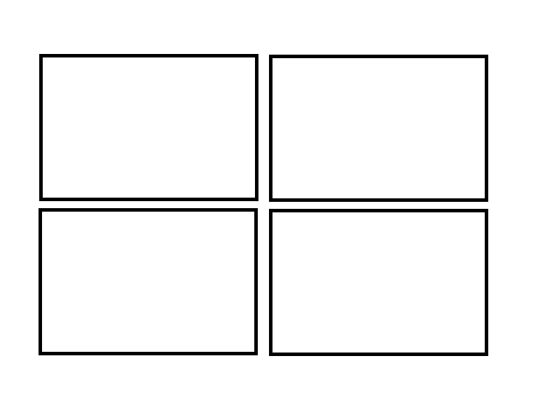
13 hours ago, bangank36 said:
I check that you are using the image blocks and drag them into 2 columns
I think we drag them into only one column. After that using some Css code to make items equally.
Gallery section is also a alternative solution
Sorry, I didn't understand what you mean. Could you clarify? And what would this CSS code look like?
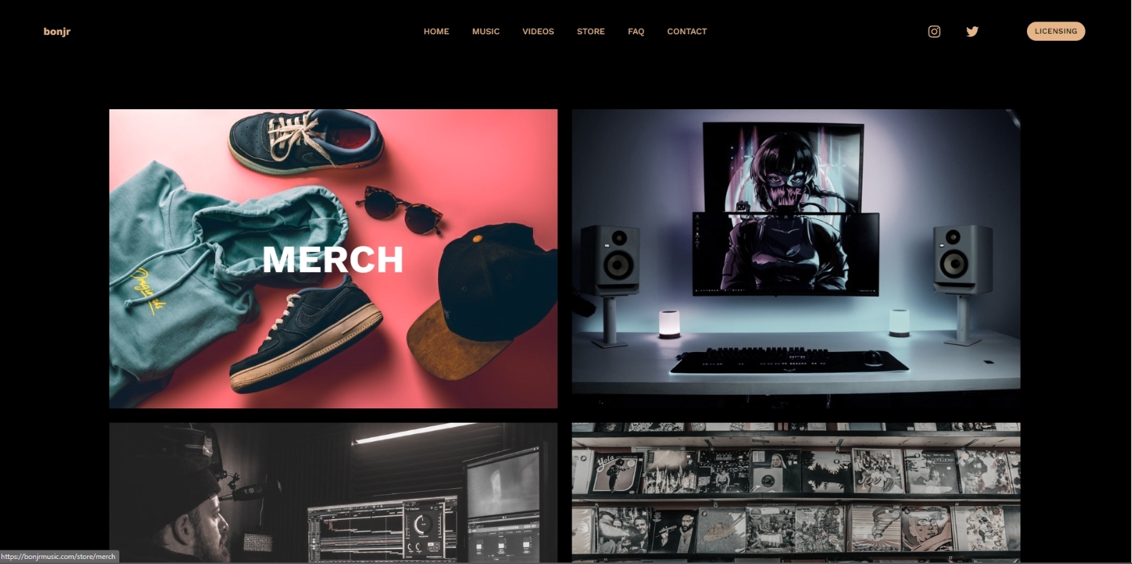
Also as you see in my examples, I would like to have 2 columns and 2 rows until the screen is reduced to the point where it is forced to become 1 column and 4 rows. -
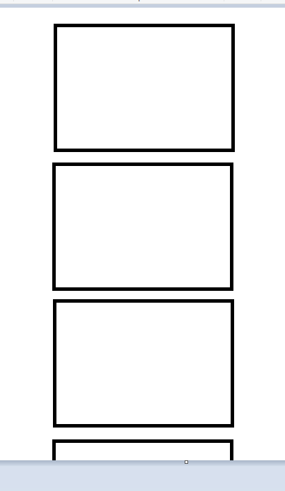
5 hours ago, bangank36 said:
I check that the layout is the same with the breakpoint equal to 768px and larger
With the smaller breakpoint (<=767px), the layout will arrange with one column. You mean set this page the same layout when breakpoint is lower than 767px, don't you?
Hi, thanks for getting back to me!
Basically this is what I want for every size possible before it gets to tablet/mobile:
And once it hits mobile, it changes to this (this already happens):
I'd also like every image to have equal dimensions.
Let me know if this clarifies everything! -
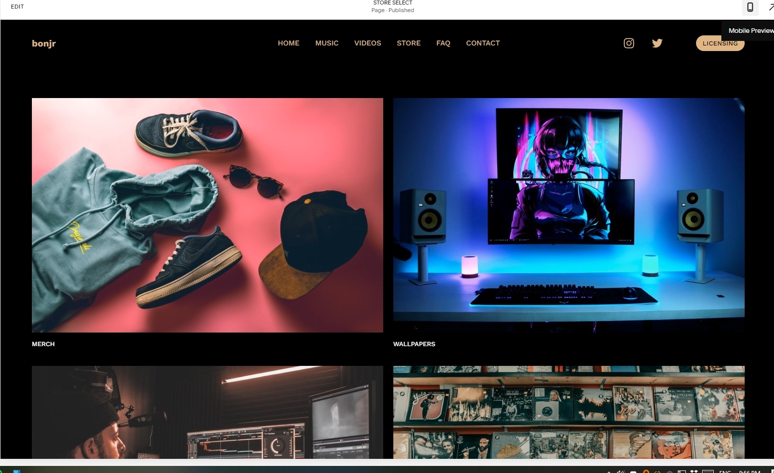
Site URL: https://bonjrmusic.com/store-select
Hi,
Could someone help me with the design of this page?
I would like to have all the image blocks be the same dimensions as well as have the elements adapt to different window sizes.
Appreciate any help I can get!
Best,
Daniel


Window resizing tweaks
in Customize with code
Posted
Perfect, thank you!