
sheriipop
-
Posts
43 -
Joined
-
Last visited
Content Type
Forums
Gallery
Blogs
Events
Store
Downloads
Profiles
Posts posted by sheriipop
-
-
On 3/20/2020 at 2:48 PM, tuanphan said:
Add to Home > Design > Custom CSS
@font-face {
  font-family: tuan;
  src: url(https://static1.squarespace.com/static/5d2b34d977f80900014edb0d/t/5e3f7cb899dd6e23d8b1e836/1581219002767/nexa-regular.otf);
}
/* Desktop */
.site-title a {
    font-family: tuan;
}
/* Mobile */
.mobile-site-title a {
    font-family: tuan;
@tuanphan I tried to use your code for the mobile site but did not work for me. What can I do to make it work? Thanks!
www.sherriedickinson.com
.mobile-site-title a { font-family: Hunter;} -
Hi! The first thing I noticed right off the bat is that there is no design consistency on your site. Consumers are generally highly visual people. You already provide great information, and I think you just need to figure out how to weave that in with a visual identity. Right now, the homepage is also looking cluttered because of all the different images that don't really go together. Canva and Unsplash are just two amazing stock photography sites you should check out for your content.
-
I don't see the white line you're talking about. Attached below is what I see and it looks perfectly fine to me 🙂

-
@bangank36, I'm sorry as I actually have one more question. How can I make the mobile site title font to be the same font as the desktop version? Thanks a bunch!
-
1 hour ago, bangank36 said:
try
#collection-606c538c686fde5fa29b74d3 article.sections {
  display: flex;
  flex-wrap: wrap;
  flex-wrap: nowrap;
}
#collection-606c538c686fde5fa29b74d3 article.sections section {
  width: 100%;
}
#collection-606c538c686fde5fa29b74d3 .sections section[data-section-id="60df4586f2f26769e1955272"] {
  width: 50%;
  float: left;
  padding-top: 0 !important;
}
#collection-606c538c686fde5fa29b74d3 .sections section[data-section-id="606c53a1bf00740418d004c3"] {
  width: 50%;
  float: left;
}
Thank you so much @bangank36!!
-
10 minutes ago, bangank36 said:
try
#collection-606c538c686fde5fa29b74d3 article.sections {
  display: flex;
  flex-wrap: wrap;
  flex-wrap: nowrap;
}
#collection-606c538c686fde5fa29b74d3 article.sections section {
  width: 100%;
}
#collection-606c538c686fde5fa29b74d3 .sections section[data-section-id="60df4586f2f26769e1955272"] {
  width: 50%;
  float: left;
}
#collection-606c538c686fde5fa29b74d3 .sections section[data-section-id="606c53a1bf00740418d004c3"] {
  width: 50%;
  float: left;
}
@bangank36 Thank you so much for the code! How can I make the slideshow bleed through the site header as well? Just like the site below.
-
3 hours ago, bangank36 said:
Add a slideshow on top of the page, we'll see how to edit it using css
Here you go – thanks!
https://www.sherriedickinson.com
PW: sdsite
-
17 hours ago, Wolfsilon said:
Hello,
On 7.1, adding a slideshow in the way that you are talking about and shown in the example above is not possible. The slideshow options are limited to specific pages instead of blocks unfortunately.
However, 7.0 templates support these Gallery/Slideshow blocks.
If you are using 7.1, you'll need to use custom code. You can build a slideshow using a Javascript library or it is also possible to build a simple slideshow using CSS.
Hi! Yes, I'm on 7.1, and had thought that CSS might be the only answer. Do you know of any resources for it? Thanks!
-
Site URL: https://www.sherriedickinson.com
I'm trying to re-create the slideshow animation the homepage below has with no luck. Can anyone help, please? Thank you!
-
9 hours ago, tuanphan said:
Use this CSS
h1.blog-title a {
    font-family: Hunter !important;
}
Thanks so much, as always!
-
5 hours ago, tuanphan said:
Add to Design > Custom CSS
/* fix issues */
@media screen and (max-width:767px) {
/* logo size */
.header-title-logo img {
    max-height: 70px;
}
/* mobile font */
div.container.header-menu-nav-item * {
    font-family: Frunchy !important;
}
/* footer space */
div#block-7f7c03cb870e582d2a02 {
    margin-bottom: 3vw !important;
}
}
Thank you so much!!
-
@tuanphan Sorry, yes, I meant Blog Title. And yes, the font name is Hunter.
-
On 5/26/2021 at 8:57 AM, tuanphan said:
The site has some problems. Do you want to fix these?
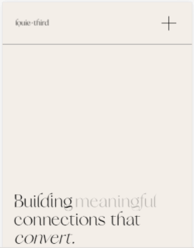
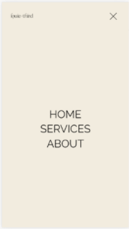
Site URL – https://www.louieandthird.com/
1. (Mobile-Header) Increase logo size?
2. (Mobile-Footer) Align left footer?
3. (Mobile-Services) Text/image overlap together
4. (Tablet/Mobile-Overlay Menu) change it to custom font?
Hi @tuanphan! Sorry, I just saw this right now. Yes, I'd like those fixed if that's no trouble. Though, I think i've already fixed numbers 2 and 3. But please, double check. Also, for the footer, how can I make the bottom space even with the top part? Thank you so much!
-
Hi! @tuanphan I'm also trying to change the title of my summary block (to Hunter). Can you help, please? None of the codes I've found here in the forum has worked. Thank you!
https://www.sherriedickinson.com/journal
pw: bblog
-
5 hours ago, tuanphan said:
Add to Design > Custom CSS
/* Header border */
header#header {
    border-bottom: 1px solid gray;
}
THANK YOU!! 🙂
-
Hi, @tuanphan! I also would like to add a border (mainly the bottom) to my navigation bar. All of the codes I've tried so far just would not work. Can you help, please?
SITE URL: http://www.louieandthird.com
PW: LTC
Thank you so much!


Site Title Custom Font for Desktop/Mobile | York Template
in Customize with code
Posted
It worked! Thanks so much @tuanphan!!