
sheriipop
-
Posts
43 -
Joined
-
Last visited
Content Type
Forums
Gallery
Blogs
Events
Store
Downloads
Profiles
Posts posted by sheriipop
-
-
Hi! How do I make sure there's no excess on the homepage when viewed on mobile and tablet? The word intentional is actually a rotating text done using the HTML code box. Thank you!
URL: https://hauserandolive.com

-
14 hours ago, Ziggy said:
That's pretty easy to achieve; you need the accordion block to be bigger than the contents, and then align the contents to the bottom of the block:
Then when the accordion opens, it expands up into the space you've created for it rather stretching down.
Oh my gosh, I didn’t know that. Thank you so much! This whole time I thought I needed a code for it.
-
Hi! I was hoping someone can help me with accordion blocks customizations. How should I go about making the tabs open upward instead of downward when clicked? Like the one on the site below. Thanks!
site: https://hauserandolive.com
inspo: https://www.all-places.com
-
9 hours ago, tuanphan said:
Hi,
Same for desktop + mobile, or desktop only?
Hi @tuanphan! Same for desktop and mobile, please. Thank you!
-
Hi @tuanphan! I'm trying to get the look of this newsletter block attached below in my footer. Can you help, please? Thank you!!
site url: www.louieandthird.com
pw: LTC
-
4 hours ago, tuanphan said:
Remove this CSS
section.blog-image-wrapper a {
    border: 1px solid #000;
    display: block;
}
Add this
section.blog-image-wrapper {
    border: 1px solid black;
    padding: 50px;
}
.summary-thumbnail-container {
    border: 1px solid black;
    padding: 50px;
}
Perfectly worked! Thank you so much!!
-
On 10/7/2021 at 1:23 AM, tuanphan said:
Yes. Sorry. Too many message recently. What is problem now?
No problem! Still the same issue as the original post. I would like to have some padding between the image and the border so it looks like the picture below. I'd like this to be applied on both the blog list and summary block. Thank you!!

-
Hi, @tuanphan ! Could you still kindly help me with this, please?
-
19 hours ago, tuanphan said:
Blog list. It looks like you solved?
With summary. You want to 2 lines border + Space between border-image??
The blog list is not fixed. I just uploaded images with the border already.
I’d like only one line of border with space between the border and image. Thank you!!
I have a question about styling buttons as well. Should I tag you in the question I submitted?
-
Hello!
I'm trying to find out how to style buttons like the one from the attached photo. The URL to the website is also below. Any help would be much appreciated! Thank you!
-
Hi @tuanphan!
Here's the actual blog: https://www.sherriedickinson.com/blog
Here's the summary block: https://www.sherriedickinson.com/journal
-
Site URL: http://www.sherriedickinson.com
Hi! I'm trying to add a padding to the blog and summary image block to look like the picture attached. I tried adding padding and border-padding to the code below but to no avail. Can anyone help me, please? Thank you!
/*Blog Summary*/ section.blog-image-wrapper a { border: 1px solid black; display: block; } .sqs-block-summary-v2 .img-wrapper, .sqs-block-summary-v2 .sqs-video-wrapper {border: 1px solid black; } -
On 7/29/2021 at 1:25 AM, tuanphan said:
Add to Design > Custom CSS
/* text image side by side-about us*/
@media screen and (max-width:767px) {
div#page-section-606c54d5aca06f6920445dda>.row:nth-child(2)>.col:nth-child(-n+2) {
    width: 50% !important;
    float: left !important;
}
}
THANK YOU!! You're the best!
-
5 hours ago, tuanphan said:
Add to Design > Custom CSS
/* Desktop overlay */
@media screen and (min-width:992px) {
div.container.header-menu-nav-item a {
    margin-top: 0.5vw;
    margin-bottom: 0.5vw;
}
a.theme-btn--primary.btn {
    font-size: 1.2rem;
    padding-top: 5px;
    padding-bottom: 5px;
}
}
THANK YOU!!
-
4 hours ago, tuanphan said:
Hi. What is site url?
www.louieandthird.com
pw: LTC
-
@tuanphan Hi! How can I make sure that the desktop hamburger menu looks exactly the same as the mobile version? The mobile one is the format I like the most, but when viewed on a desktop, the line height of the nav links are too much and the button font is a little too big. Images below – Left image is what the desktop view currently looks; right image is the mobile view and what I want. Thank you!!
-
On 7/24/2021 at 7:08 PM, tuanphan said:
Q5. Add to Design > Custom CSS
/* Reel responsive */
@media screen and (max-width:991px) {
.gallery-reel {
    height: 35vh !important;
}
}
Q4. If overlap on mobile, text/image will be very small.
I think stacked is better. Also do you want to move image to above text?
Q5. Thank you for the code!!
Q4. I'd like to see how it would look with the code first, please? -
21 hours ago, tuanphan said:
Q3. 4. It looks like you fixed. Do you need help with Q5?
Yes to Q5, please! Also, for Q4 I'd actually like the overlapping images to look the same on mobile view as it does on desktop view. I haven't found anything yet to help with that.
-
14 hours ago, tuanphan said:
Use new code
/* Mobile */
@media screen and (max-width:640px) {
/* Footer 2 columns */
div#page-section-60a9baaff1f34945c7e6029d .span-6 .span-3 {
    width: 40% !important;
    float: left !important;
}
div#page-section-60a9baaff1f34945c7e6029d .span-6 .span-3:nth-child(2n+1) {
    clear: left;
}
}
Thank you!!
-
On 7/14/2021 at 12:48 AM, tuanphan said:
Q1. Add to Design > Custom CSS
/* Mobile */
@media screen and (max-width:640px) {
/* Footer 2 columns */
div#page-section-60a9baaff1f34945c7e6029d .span-6:nth-child(2)>.row .span-2:nth-child(-n+2) {
    width: 40% !important;
    float: left !important;
}
div#page-section-60a9baaff1f34945c7e6029d .span-6:nth-child(2)>.row .span-2:nth-child(3) {
    clear: left;
}
}
Q2. Mobile, do you want to stacked them?
The footer code to make 2 columns on mobile is no longer working.. 😕
-
On 7/16/2021 at 12:31 AM, tuanphan said:
Missing 1 code. Try this new code
/* Split section on tablet-mobile */
@media screen and (max-width:991px) {
section[data-section-id="606c53a1bf00740418d004c3"], #collection-606c538c686fde5fa29b74d3 article.sections section {
    width: 100% !important;
    float: none !important;
}
#collection-606c538c686fde5fa29b74d3 article.sections {
    flex-wrap: wrap !important;
}
section[data-section-id="606c53a1bf00740418d004c3"] {
    width: 100% !important;
    float: none !important;
    min-height: unset !important;
}
body.homepage .gallery-fullscreen-slideshow {
    height: 40vh !important;
}
}
Thank you!!
-
3 hours ago, tuanphan said:
Add to Design >Custom CSS
/* Split section on tablet-mobile */
@media screen and (max-width:991px) {
section[data-section-id="606c53a1bf00740418d004c3"] {
    width: 100% !important;
    float: none !important;
}
#collection-606c538c686fde5fa29b74d3 article.sections {
    flex-wrap: wrap !important;
}
section[data-section-id="606c53a1bf00740418d004c3"] {
    width: 100% !important;
    float: none !important;
    min-height: unset !important;
}
body.homepage .gallery-fullscreen-slideshow {
    height: 40vh !important;
}
}
This code is giving this preview?
-
8 hours ago, tuanphan said:
Q1. Add to Design > Custom CSS
/* Mobile */
@media screen and (max-width:640px) {
/* Footer 2 columns */
div#page-section-60a9baaff1f34945c7e6029d .span-6:nth-child(2)>.row .span-2:nth-child(-n+2) {
    width: 40% !important;
    float: left !important;
}
div#page-section-60a9baaff1f34945c7e6029d .span-6:nth-child(2)>.row .span-2:nth-child(3) {
    clear: left;
}
}
Q2. Mobile, do you want to stacked them?
Yes, let's stack them, please!
-
On 7/11/2021 at 7:32 AM, tuanphan said:
@louieandthird Do you still need help?
Also, do you need fix these? We will help
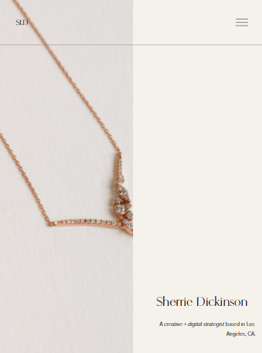
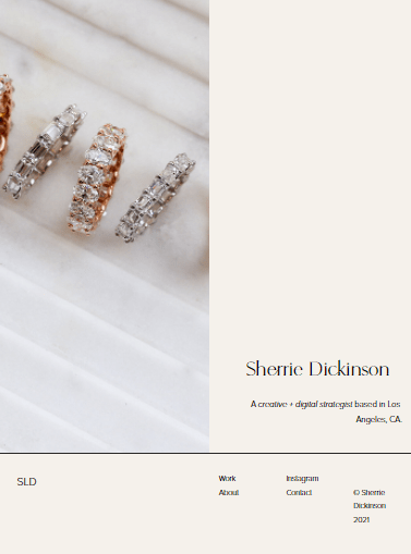
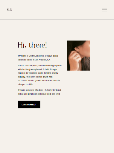
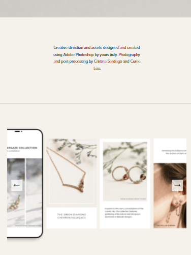
Site URL: https://www.sherriedickinson.com/
1. (Mobile – Footer) make footer links to 2 columns
2. (Mobile/Tablet – homepage) Image don’t show in full size
3. (Tablet – Footer) Make “© Sherrie Dickinson 2021” in the same line
4. (Tablet/Mobile – About) Image disappear.
https://www.sherriedickinson.com/about
5. (Mobile/Tablet – Portfolio > Content creation) Image don’t show in full size, want to resize image? Increase text width and reduce space above/below text?
https://www.sherriedickinson.com/creatives
@tuanphan oh, wow! I didn't realize all of those issues before. Yes, please help if it's no trouble! Thank you so much!!


Excess on homepage when in mobile and iPad views
in Customize with code
Posted
Thought I had included the URL, sorry about that!
URL: https://hauserandolive.com