
lamdra
-
Posts
63 -
Joined
-
Last visited
Content Type
Forums
Gallery
Blogs
Events
Store
Downloads
Profiles
Posts posted by lamdra
-
-
Site URL: https://yampa-icehouse.squarespace.com
Anyone know how to adjust the padding on this block for mobile only?
I've added some CSS but doesn't seem to working. Basically I removed the padding in that section to have my images and scrolling block go to the edges but on mobile the text is unreadable.
Appreciate any help, thanks.
site: https://yampa-icehouse.squarespace.com
pass: smok

-
Site URL: https://yampa-icehouse.squarespace.com
I'm using the scrolling block for the first time. And after adding some CSS code to control the font in there it's acting very strangely. Even if I pull the code out it remains all cut off. Anybody experience this before?
I'll attach how it looks currently and how it should look...
site: https://yampa-icehouse.squarespace.com
pass: smok
CSS I'm using to edit the contents:
div.marquee-block * {
font-family: 'atrament-web'!important;
font-weight: 500!important;
letter-spacing: 0.05em!important;
text-transform: uppercase!important;
line-height: 0em!important;
padding-top: 0px!important;
}section[data-section-id="62bf411d5f0d75795dcecb37"] {
.content-wrapper {
padding: 0 !important;
max-width: 100vw;
}
}Appreciate any insight into why this is happening. Thanks!
-
Site URL: https://yampa-icehouse.squarespace.com
I'm hoping to align the navigation links with the top of the logo instead of centered vertically with it. Basically this logo is really tall so it pushes the nav further down than I'd like. Is there anyway to affect the position of just those?
Thanks!
site: https://yampa-icehouse.squarespace.com
pass: smok
-
10 minutes ago, paul2009 said:
The ellipses is the unique reference for your eventbrite event, which is why I haven't shown it. To style all the buttons in the same way, simply add the class as I explained, and then refer to this class in your Custom CSS instead of referring to the ID. If you need more help, please provide some details of the code you have added and what isn't working for you.
right, I get it's a unique event which is what I used for the button styling, just wasn't sure what syntax is needed to add more events since I'm not familiar with how to write that code and separate them (I.e comma, semicolon, etc. I haven't implemented it yet but will paste the code in when I do.
Thanks for the reply.
-
On 2/25/2022 at 3:59 PM, paul2009 said:
Yes, if you can add a class to the eventbrite button when you paste in the code you can then use this to target all the buttons with the same class.
For example:
<button class="myeventbutton" id="eventbrite......And then you'd put your styles within this:
button.myeventbutton {

}
Looking for this as well, I was able to style the individual button but this will save a lot of time. What would be the proper way to list multiple id's in that class (looking for what fills in those elipses in your example?)
Thanks! -
On 11/7/2021 at 1:28 AM, tuanphan said:
Use this tool to find data section id.
Thanks for that, I was using a different extension that called out the header section.
-
6 hours ago, bangank36 said:
Try
section[data-section-id="61846d6adeb0e63272bb2812"]  .content-wrapper {
  padding:0 !important;
}
Let me know how it works on your site
Press 👍 or mark this answer as solution to help another one too
That did it! Thank you! Can you tell me how you resolved it? Seems like I was just targeting the wrong section id but I thought I had it identified correctly. Thanks for your help.
-
Site URL: https://midnight-revival.squarespace.com
Does anyone know how I can remove the padding from this section and the images within. Essentially I want the 2 images to take up the entire section but I can't seem to get rid of the background at the bottom and on the sides in mobile. Images attached.
https://midnight-revival.squarespace.com
password: midnight
I'm currently using this code but still get a sliver on the bottom for desktop and all around on mobile:
section[data-section-id="61816aad28ce603e37e25798"] .content-wrapper {
padding-top:0 !important;
padding-bottom:0 !important;
padding-right:0 !important;
padding-left:0 !important;
}#block-yui_3_17_2_1_1636068733069_2859 {
padding: 0px !important;
}#block-yui_3_17_2_1_1636068733069_3898 {
padding: 0px !important;
}
-
On 10/30/2021 at 7:37 PM, tuanphan said:
How do you want the text to appear on the desktop-tablet-mobile?
I'd like there to be padding on the left of the text when it drops down a line. The way "Call Loca" looks is what I'm after but unless I manually add a return and a space I can't get it. For example what you see before "Time" is what it looks like if it just automatically drops a line in smaller screens.
Is there a way to keep that left padding even when the sentence breaks into multiple lines? -
On 10/22/2021 at 4:29 AM, tuanphan said:
8989
Incorrect password.
Can you check it again?
@bangank36 @tuanphan Any thoughts? Site is no longer password protected. You can recreate the issue on mobile version of this page
https://www.cantinaloca.com/our-story
Thanks for your help! -
On 10/22/2021 at 4:29 AM, tuanphan said:
8989
Incorrect password.
Can you check it again?
site is live now at cantinaloca.com. Would love to help resolve this issues. Thanks for looking!
-
2 hours ago, lamdra said:
No, I haven't actually. I worked around it for now by doing a hard return and adding a space before the line. But that's not ideal. Do you know how I can fix this without the forced return?
Still happens on longer headlines where I can't control the line breaks.
-
4 minutes ago, bangank36 said:
It seems that you 've solved your issue on your own, doesn't it?
No, I haven't actually. I worked around it for now by doing a hard return and adding a space before the line. But that's not ideal. Do you know how I can fix this without the forced return?
-
I'm using the following code to add a highlight to my h2 when bolded but the highlight is abrupt when the line breaks in mobile or smaller browser size. Is there a better way to do this so that the highlight feels more like a background around all letters with equal space?
h2 strong {
background: #1b1b1a;
padding-top: 7px;
padding-bottom: 7px;
font-weight:normal !important;
}URL: https://cantina-loca.squarespace.com/
Password: 8989
-
8 hours ago, tuanphan said:
Hi. Have you solved it yet?
Also
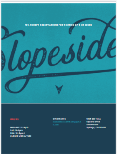
Site URL – https://slopeside.squarespace.com/
1. (Tablet-Homepage) resize image?
Yes, the fonts appear to be working well now on mobile. Thanks for following up!
Not sure what you're showing me on the table resize? Looks like the opentable widget disappeared on your screen but I can't recreate that. Is that it?
-
Looks like I was able to fix it by removing some code that addressed the line width. No idea why that affected fonts on mobile though?
-
Having same issue where custom font is not showing up on mobile. I've looked at all the above code but seems to check out. Need some expert guidance here.
https://slopeside.squarespace.com/
password: 970
@font-face {
font-family: 'heinberg';
src: url('https://static1.squarespace.com/static/60c7cc3317a5377b8eb02b43/t/60c90fe2cf09566543ea5a30/1623789538887/heinberg-regular-webfont.woff') format ('woff');
}
/* Custom Fonts */
h1, h2, h3, h4 {
font-family:'heinberg' !important;
letter-spacing: 3px;}
.header-nav *, nav.header-menu-nav-list * {
font-family:'heinberg'!important;
letter-spacing: 3px;
}Any thoughts here @tuanphan? Thanks!
-
26 minutes ago, tuanphan said:
Hi. Sorry for the delay.
This will requires JavaScript. Which plan do you use?
I’m in the business plan.
-
On 11/6/2020 at 2:39 AM, tuanphan said:
Can you share link to page where you embed opentable? We can check easier
Of course, it's currently at http://primrosesteamboat.com/
-
On 8/2/2020 at 6:35 PM, tuanphan said:
Add to Home > Design > Custom CSS
/* open table background */
.squarespace-opentable-new-age-wrapper {
    background: #862633 !important;
}
/* Button */
.squarespace-opentable-new-age-wrapper input {
    background: darkgrey !important;
}
I just implemented this on my site as well but is there a way to move the "Find a table" button to the right? So that they're all in the same row? Thanks!
-
Perfect, thanks again!
-
Site URL: https://sepia-butterfly-e3x7.squarespace.com/
I'm working through adjusting the mobile style settings for my new site but keep running into areas in 7.1 that don't seem to be adjustable without custom code. Does anyone know how I can adjust the size of the hover text in the portfolio when in mobile?
Looks great on desktop but get's really large in mobile. Hoping for some CSS that can let me control that sizing. Desktop and Mobile screen captures attached.
Thanks for your help!
https://sepia-butterfly-e3x7.squarespace.com/
Password: 1234


move navigation up aligned with top of logo instead of center?
in Site Design & Styles
Posted
Thanks! That worked great for the navigation but not the social links. Does that need a separate code?