

pgcreativedesigns
-
Posts
32 -
Joined
-
Last visited
Content Type
Forums
Gallery
Blogs
Events
Store
Downloads
Profiles
Posts posted by pgcreativedesigns
-
-
@tuanphan I’m having this same issue on https://www.amplifyvocalstudio.com with the login button. Is there a way to make it match the same spacing, size and font size as the second button on both desktop and mobile menu? Thanks so much!!
-
On 2/3/2022 at 5:28 PM, tuanphan said:
Add to Design > Custom CSS
div.sqs-slice-group.group-copy.copy-layer-background {
    border: 2px solid white;
}
Hi @tuanphan - Thank you for this!! I added to custom CSS and it still doesn't seem to be showing up on desktop or mobile...? Is there something else I need to do?
-
Has anyone figured this out yet? I'd love to add a 2px white border to the pop up on patrickgarr.com. Thanks!
-
On 5/16/2021 at 4:47 AM, tuanphan said:
Add to Design > Custom CSS
/* Mobile-coaching order */
@media screen and (max-width:767px) {
div#block-yui_3_17_2_1_1620578529243_15151+.row {
    -webkit-box-orient: vertical !important;
    -webkit-box-direction: normal !important;
        -ms-flex-direction: column !important;
            flex-direction: column !important;
}
}
@tuanphan this worked perfectly for this page!! Is there a way to also reorder the text on the masterclass page on mobile to be in number order? Thanks so much for your help!
-
19 hours ago, tuanphan said:
Add to Design > Custom CSS (for Coach)
@media screen and (max-width:767px) {
div#block-yui_3_17_2_1_1620578529243_15151+.row {
    -webkit-box-orient: vertical !important;
    -webkit-box-direction: normal !important;
        -ms-flex-direction: column !important;
            flex-direction: column !important;
}
}
If it works, I will check another page
@tuanphan this worked PERFECTLY! Thank you. I would love to also fix it on the masterclass page. Let me know if there's a good way to do it there also.
-
1 hour ago, tuanphan said:
You want this order on mobile?

@tuanphan yes! And I’d love for the other page to order properly from #1-4 on mobile as well. Thanks!!
-
43 minutes ago, tuanphan said:
Hi. Which pages? Can you share link/screenshot?
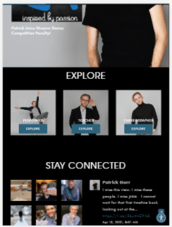
Absolutely @tuanphan! It is www.patrickgarr.com/coach under "Offerings" and the images reverse on mobile. The same thing happens on www.patrickgarr.com/masterclasses under "The Bootcamp" where the text reverses on mobile. I'd love to have these in order! I have screenshots below for both.
-
On 5/11/2021 at 11:15 PM, tuanphan said:
I see 2 small problems. Do you need to fix these?
Site URL – https://www.patrickgarr.com/
1. (Mobile/Tablet) 2 icons on bottom right overlap. Want to add a space?
2. (All devices-Blog posts) Comment text is white color. Want to change it to black?
Hey there @tuanphan! I was actually able to fix the blog comment box font issue with some css. All should look good on that. Thank you for alerting me of that issue!
Do you have any ideas how to fix the mobile issues of text/image order on the other two pages above or the spacing issue you noticed? I'd love to get those fixed asap before launching. Thanks again for your help!
-
@tuanphan Yes! That would be perfect. I didn’t catch those. Thank you for noticing those. I’d love to fix both.
I also noticed that on patrickgarr.com/coach (under offerings) and patrickgarr.com/masterclasses (under bootcamp), the icons/text are out of order on mobile and stacking incorrectly. Is there a way to also fix that issue?
Thank you for all your help!
-
On 5/9/2021 at 12:20 PM, pgcreativedesigns said:
Hi @tuanphan! Is there any easy way to also do this on this page (https://www.patrickgarr.com/coach under offerings) to keep the desktop order of icons on mobile? And also here (https://www.patrickgarr.com/masterclasses under bootcamp) to keep the numbering in order for mobile?
I also had this issue with image icons under a member area (trying to keep them in correct sequence of weeks on mobile). Is there any easy way to adjust this code for different sections?
Thank you TREMENDOUSLY for any and all advice!
PG
If anyone has insight on this, I'd love any tips! I still haven't found a solution just yet. Thanks for any and all advice!
-
On 4/17/2021 at 4:46 AM, tuanphan said:
Add to Design > Custom CSS
/* Coaching order mobile */
@media screen and (max-width:767px) {
div#sqpl-tab-group-0 .sqpl-tab-content .row {
    display: -webkit-box;
    display: -ms-flexbox;
    display: flex;
    -webkit-box-orient: vertical;
    -webkit-box-direction: reverse;
        -ms-flex-direction: column-reverse;
            flex-direction: column-reverse;
}
}
Hi @tuanphan! Is there any easy way to also do this on this page (https://www.patrickgarr.com/coach under offerings) to keep the desktop order of icons on mobile? And also here (https://www.patrickgarr.com/masterclasses under bootcamp) to keep the numbering in order for mobile?
I also had this issue with image icons under a member area (trying to keep them in correct sequence of weeks on mobile). Is there any easy way to adjust this code for different sections?
Thank you TREMENDOUSLY for any and all advice!
PG
-
-
@tuanphan Did anyone figure this out? I am trying to do the same with buttons on patrickgarr.com/home (password: pg2021) to center the buttons at the bottom of the images. It sort of worked on the first but still looks off. Is there also a way to bold the button font with css for just these three images? Thanks for any advice!
-
On 4/17/2021 at 4:46 AM, tuanphan said:
Add to Design > Custom CSS
/* Coaching order mobile */
@media screen and (max-width:767px) {
div#sqpl-tab-group-0 .sqpl-tab-content .row {
    display: -webkit-box;
    display: -ms-flexbox;
    display: flex;
    -webkit-box-orient: vertical;
    -webkit-box-direction: reverse;
        -ms-flex-direction: column-reverse;
            flex-direction: column-reverse;
}
}
@tuanphan This worked PERFECTLY! Thank you tremendously for your help!
-
On 4/11/2021 at 10:26 PM, tuanphan said:
Hi,
Add left: 50%; and transform translate -50%
.user-accounts-link .user-accounts-text-link span.unauth:before {
    visibility: visible;
    content: "LOGIN";
    font-size: inherit;
    color: #fff;
    font-family: Lato;
    text-align: center !important;
    position: absolute;
    font-weight: 400;
    letter-spacing: .02em;
    left: 50%;
    transform: translateX(-50%);
}
This worked perfectly @tuanphan! Thank you so much!
-
@tuanphan I'm also having a similar issue on two pages. I'm wanting to swap blocks on mobile for patrickgarr.com/coaching and patrickgarr.com/masterclasses under the tabs so that the image stacks on top of the text for each on mobile. Is there a way to do this? Thank you for all of your help!
-
On 4/5/2021 at 6:22 AM, tuanphan said:
Add this to Last Line in Code Injection Footer
<script>
$(document).ready(function() {
		$('.header-menu-nav .user-accounts-link').insertAfter('.header-menu-cta>a:first-child');
	});
</script>
This worked perfectly! Thank you so much @tuanphan. Do you know if there's a way to now center the text and that button only on the mobile navigation to match the contact? Thank you!!

-
Hi @tuanphan! Is there any way to edit the customer account login order on mobile? I have used css to change it to a button and moved the placement on desktop (to be after the contact button). However, I still can't get the placement of the login link on mobile to follow the contact button? I'd also love the button size/styling to match the contact button on mobile? I attached an image below. The link to the site is https://www.jennifergellerfitness.com/home. Thanks for any insight! I greatly appreciate it.
-
@tuanphan It is also breaking the full width background for the whole page now. Any way to fix this? Is there also a way to justify the text to center on mobile for the typewriter since it goes onto a second line of text? Thanks for your help!!
-
@tuanphan anyone have any luck with this? I have tried this and removed the section and it's also breaking the full-width background... Any help much appreciated! Link: www.amplifyvocalstudio.com/homenew
-
@tuanphan has this been solved? I would love any insight to this. I have a lightbox button on patrickgarr.com/coaching under private coaching that says “apply here” that I would like to hide when I am not accepting applications. Thanks for any help!
-
@tuanphan this worked perfectly! Thank you SO much for your help figuring this out. I appreciate it.
-
@tuanphan For some reason that took it away completely on desktop... Not sure if it's also because I have the below code to change and hide the "sign in" text that I am replacing.
.user-account-link span.unauth {
visibility: hidden;
} -
@tuanphan Thank you!! I really appreciate this. It did fix it on mobile. However, it then centered behind the site title on desktop. Is there anything I need to do to rearrange that but keep mobile center?


Edit "Login" Button In Mobile Navigation
in Customize with code
Posted
Hi @tuanphan! This definitely seemed to work a bit. For some reason the padding still isn't matching the Join For Free button on mobile... is there a way to fix this so these are both the same size? Thanks!