
s7udiostars
-
Posts
17 -
Joined
-
Last visited
Content Type
Forums
Gallery
Blogs
Events
Store
Downloads
Profiles
Posts posted by s7udiostars
-
-
On 11/2/2021 at 9:18 AM, tuanphan said:
Add to Design > Custom CSS
/* Mobile Related Products */
@media screen and (max-width:767px) {
.ProductItem-relatedProducts.ProductList .list-grid {
    display: grid;
    grid-template-columns: repeat(2,1fr);
    grid-column-gap: 10px;
}
}
Hey @tuanphan would you be able to make our (mobile) product on a row of 3 or 4 instead of one?
thank you 🙂 -
8 hours ago, tuanphan said:
Add to Design > Custom CSS
/* Mobile Related Products */
@media screen and (max-width:767px) {
.ProductItem-relatedProducts.ProductList .list-grid {
    display: grid;
    grid-template-columns: repeat(2,1fr);
    grid-column-gap: 10px;
}
}
@tuanphan looks good, thank you! :))
-
On 9/20/2021 at 2:50 PM, tuanphan said:
#1. Add to Design > Custom CSS. If it works, I will continue checking other problems
/* Mobile center footer */
@media screen and (max-width:767px) {
footer.sections * {
    text-align: center !important;
}
}
@tuanphan i was here i reffered to 🙂
i belive we are at this step "5. (Mobile-Products) Change related products to 2 items/row" -
21 hours ago, tuanphan said:
Ah okay, maybe its just mine 🙂
@tuanphan what was the next step ? -
6 hours ago, tuanphan said:
Which code did you add?
above 2 code for 2 websites
@tuanphan These is all code i have added 🙂

-
56 minutes ago, tuanphan said:
Add to Design > Custom CSS
@media screen and (max-width:767px) { div#page-section-60a16b3a6bbf946c5d043b2e .span-5 .span-4 .span-2 { width: 50% !important; float: left !important; } }@media screen and (max-width:1024px) and (min-width:768px) { /* image 123 */ div#block-yui_3_17_2_1_1626345508961_40873+.row .image-title * { font-size: 20px; } /* image 456 div#page-section-6058d2ded607a06ccc5e14c8 .image-title * { font-size: 20px !important; } /* image 789 */ div#page-section-605906607b4d59585583ac12 .image-title * { font-size: 20px; } }@tuanphan just tried 🙂
-
9 hours ago, tuanphan said:
#2. I see it is fine to me. You can check again
it looks like this, when i choose "ipad"
-
1 hour ago, tuanphan said:
#2. It looks like you changed text & solved?
#3, #4. Use this CSS
/* tablet align menu social */
@media screen and (max-width:991px) and (min-width:768px) {
.header-menu-actions {
    margin-left: 7vw;
}
}
/* Mobile */
@media screen and (max-width:767px) {
/* Shop page category links */
ul.nested-category-children {
    flex-wrap: wrap !important;
}
}
@tuanphan I dont think i have changed text?
But #3 and #4 looks good now ! thank you :)! -
On 9/20/2021 at 2:50 PM, tuanphan said:
#1. Add to Design > Custom CSS. If it works, I will continue checking other problems
/* Mobile center footer */
@media screen and (max-width:767px) {
footer.sections * {
    text-align: center !important;
}
}
@tuanphan #1 did work, and looks super good, thank you!
I am exited about the other codes 🙂 -
On 6/24/2021 at 10:55 AM, tuanphan said:
Do you want fix these?
Site URL – https://www.s7udiostars.com/
1. (Mobile-Footer) Center all elements in footer?

2. (Tablet-Homepage) Reduce text size?
3. (Tablet-Header) Align social – menu?
4. (Mobile-Shop) Change category links to 2/3 lines, instead of scrollbar
5. (Mobile-Products) Change related products to 2 items/row?
6. (Mobile-Products) Change related products to 2 items/row?
Hi there! that would be amazing, thank you i appriciate it a lot!
i actually first now have been able to find this again, as i wanted to ask you about those things :) -
1 hour ago, tuanphan said:
Don't remove any code. Add this to Design > Custom CSS
@media screen and (max-width:767px) {
div#page-section-6058d2ded607a06ccc5e14c8 .span-4 {
    width: 50% !important;
    float: left !important;
}
body.homepage .design-layout-poster * {
    font-size: 14px;
}
}
you are truly amazing! Thank you so much!
-
5 hours ago, tuanphan said:
Add this to Settings > Advanced > Code Injection > Footer >> Then save & check on real mobile
<script src="https://ajax.googleapis.com/ajax/libs/jquery/3.5.1/jquery.min.js"></script>
<script>
jQuery(document).ready(function($){
if (jQuery(window).width() < 767) {
$('div#page-section-6058d2ded607a06ccc5e14c8 .span-4:first-child').insertAfter('div#page-section-6058c92dd9372926209ce60b .span-4:nth-child(3)');
}
});
</script>
<style>
  @media screen and (max-width:767px) {
  div#page-section-6058c92dd9372926209ce60b .span-4, div#page-section-605906607b4d59585583ac12 .span-4 {
  	width: 50% !important;
    float: left !important;
  }
    div#page-section-6058c92dd9372926209ce60b .span-4:nth-child(2n+1) {
  	clear: left !important;
  }
  }
</style>
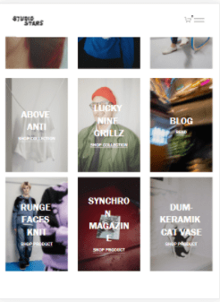
Thank you, it helped. but some of the pictures are not getting smaller / side by side. and the text is cramping up, is there are possiblity to get all of them small?
thank you so much! -
yes, that is what im loking for 🙂
-
On 4/15/2021 at 8:28 AM, tuanphan said:
Hi. Add to Design > Custom CSS
/* Posters side by side */
@media screen and (max-width:767px) {
div#page-section-5f634825731cc06411c4b7da .span-4 .image-block {
    width: 50% !important;
    float: left !important;
    padding: 0 !important;
    clear: none !important;
}
div#page-section-5f634825731cc06411c4b7da .span-4 .image-block:nth-child(2n+1) {
    clear: left !important;
}
}
Hey Tuanphan. I have tried to add this, but it have not worked, can you maybe guide me? my website is https://www.s7udiostars.com/ 🙂


Images side by side on mobile
in Customize with code
Posted
@tuanphanyes here: https://www.s7udiostars.com/all