

jenniferboddam
-
Posts
72 -
Joined
-
Last visited
Content Type
Forums
Gallery
Blogs
Events
Store
Downloads
Profiles
Posts posted by jenniferboddam
-
-
thanks! that worked great!, is there a way to target just the lines though and not everything in the section?
-
I think I need fresh eyes, can anyone explain what isn't working with my css? I have fixed buttons on the sides of my pages. I had them working on desktop and mobile, but tablet wasn't showing up because I had messed around with it too much I think.
so started over using the side that worked perfect and got it to show up on tablet but now on desktop and tablet one button is not fully to the edge, mobile is fine.
Previous code that some how worked on desktop ( was full width, worked on desktop and mobile wouldn't show up on tablet)
Quote/*STYLES FOR FLOATING BUTTON -PREV */
#previous-page {
position: fixed;
top: 92%;
right: 1240px;
transform: rotate(90deg) translateX(0%);
transform-origin: 100% 0;
:hover {
background-color: #F42D27; /* red */
color: white;}
z-index: 99999;
}
#previous-page a {
background: #ADAA99;
color: white;
display: inline-block;
font-size: 14px;
font-weight: bold;
text-transform: uppercase;
font-family: "brother-1816";
padding: 10px 30px;
}
@media only screen and (min-width: 280px) and (max-width: 992px)
{
#previous-page{
bottom: 0;
right: 280px;
top: auto;
transform: none;
}
#previous-page a {
padding: 10px 30px;
}
}New code that works on mobile, desktop and tablet but now doesn't sit flush to the edge on desktop and tablet..
Quote/*STYLES FOR FLOATING BUTTON (UPDATED)*/
#previous-page {
position: fixed;
top: 75%;
left: 0px !important;
transform: rotate(270deg) translateX(0%);
transform-origin: 100% 0;
:hover {
background-color: #F42D27; /* red */
color: white;}
z-index: 99999;
}
#previous-page a {
background: #ADAA99;
color: white;
display: inline-block;
font-size: 14px;
font-weight: bold;
text-transform: uppercase;
font-family: "brother-1816";
padding: 10px 30px;
}
@media screen and (max-width: 1024px) {
#previous-page {
bottom: 0;
top: auto;
transform: none;
}
#previous-page a {
padding: 10px 30px;
}
@media screen and (min-width:600px) {
#previous-page {
bottom: 0;
top: auto;
transform: none;
}
}
}see screenshot for where its sitting, I cant seem to move it over any further then that on both desktop and tablet?
site is : https://flugelhorn-seahorse-lzrb.squarespace.com/?p
pw: design123
buttons are on the portfolio pages
any suggestions is much appreciated

-
@tuanphan Thank you! if I wanted to make them really close together how would I target that, doing padding top/bottom doesn't seem to effect it ?
-
@tuanphan ok I added a section with two lines on the home page, right above the footer/below the reviews
section id: section[data-section-id="6147c33758d0d12c942cc8fd"]
-
Its literally faster for me to delete all my images and re upload them in the exact order I want, it just wont let me rearrange at all i move one and the rest get shuffled. It's driving me crazy. I'm going to put a ticket it to let them know but it probably wont be fixed any time soon.
7.1 has grown on me but so many things make the work flow sooo unbelievably slow its frustrating.
-
I'm trying to get several horizontal lines on my site to be full width, not all of them.
I am using
#block-yui_3_17_2_1_1631810515381_17071
{ width: 100% !important; }to target a specific one, but it only extends to the right and not the left I tried targeting hr as well and it didn't work
Ideally I'd like to have two lines in some places a few pixels apart, I've attached a screen shot I've tried using
#block-yui_3_17_2_1_1631812436781_3916
{width: 100% !important;
padding-top: -100px !important;}
as well and I'm not seeing any movement. How do you target the specific lines to be full bleed?site is https://flugelhorn-seahorse-lzrb.squarespace.com/
pw: design123
-
@tuanphan is it possible to remove the arrow background colour/circle from this slider?
-
@tuanphan No I use a ipad mini, its so weird idk why its not showing up when it shows up fine on the others
-
Hi @tuanphan
So I saw movement on my desktop of the previous button but when I go to look at it on my tablet it still doesn't show up? desktop and mobile is fine? I attached an image of the tablet not showing it
-
hey its https://flugelhorn-seahorse-lzrb.squarespace.com/?p
and pw: design123
I don't have a plan yet but will be getting the business plan once I'm ready
-
hi @tuanphan is there a way to keep the contact button outside of the burger menu? I have the burger menu set up on the left and Id like the button to stay out side on the right at all times
-
Thank you for the break down, for sure clears it up!
and yeah I figured that might be the case here with this one. I added everything in the way you showed and its just not working. And I think for what I want it for it would be too complicated for squarespace to work with sadly. But good to know how it all works anyways, appreciate you taking the time!
-
Ok thank you, I will wait for your example, Do the <script> dependencies go in the code block or do all dependencies go into the page header?
-
@iamdavehart ah ok thank you so much!!
So I was doing the first part correct that you explained, basically everything in the codeblock wrapped in its own tag.
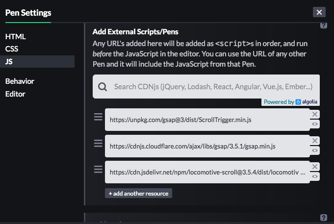
I'm not sure if I'm fully clear on the dependencies part yet. I attached a screen shot. Is that what you mean? under the JS section and then those three links would be wrapped in <scrip></script> tags underneath the rest inside the code block?
I did that and it hasn't seemed to change anything to get it to work. I also ask the author of the code pen about using it in squarespace and they said "I think it might be possible if you installed the GSAP and Locomotive libraries via CDN"
I have no idea what gsap/ locomotive libraries or CDN are, is that what the dependencies are or is it something else?
thank you for the clear explanation so far though! it cleared up what I was initially confused about
-
@DonnaMartinek right? same I swear I've searched the whole of the internet and still don't understand, very frustrating to be at your fingertips and almost understand it and it just not work.
maybe @tuanphan or @creedon might know?
-
hi @tuanphan Im trying to get this : https://codepen.io/cameronknight/pen/qBNvrRQ
on my site but I'm not sure why its not working? and when i did add the css it messed up other pages instead of the one page I wanted it on. any help is super appreciated!
-
-
I am trying to do sticky next and prev buttons on each of my portfolio pages, I've managed to get them to work on my desktop as well as mobile but when i go to check on my tablet only the one button ("next") shows at fullscreen. The only time I can see the second "prev" button is when its half screen view on the tablet squarespace app.
I am using this:
@media only screen and (min-width: 280px) and (max-width: 992px) to target the sizes,
the only way it will fit or show up on the mobile is when I do 280 px and I've messed around with it so much now so I'm a bit lost on how to get it to show on a full sized tablet as well any insight is appreciated
site is :
https://flugelhorn-seahorse-lzrb.squarespace.com/aqua-de-vida
pw: design123
-
@tuanphan yes its
https://flugelhorn-seahorse-lzrb.squarespace.com/?p
pw: design123
I just want to be able to add 1px lines where id like not just at the border of each section but within each section, so is there a way to target the movement of the line?
-
I've looked everywhere and I'm still not sure I understand how to take codepen code and add to squarespace. All I've seen is to just add a code block and put it all in the code block? I can get the html and css to work but soon as I try the Js it doesn't work. I was trying to test out this as a practice to try and figure it out.
https://codepen.io/cameronknight/pen/qBNvrRQ
on this page https://flugelhorn-seahorse-lzrb.squarespace.com/code-test-page?p?p
pw: design123
I cant find any clear information on how to integrate codepen to squarespace. If anyone has straight forward instructions or youtube videos / links etc where I can research this more I'd appreciate it. I think I'm just not sure where each part gets placed into squarespace or when to change an id to something squarespace specific? I think I just need it really dumbed down.. lol
-
is there a way to move the line up and down the page horizontal & vertical? I've tried using
position % but cant see it working
I was using
Quote.page-section[data-section-id="61141142cc01a74ed5bfead4"] {
border-top:1px solid #222;
}but say I want to have a double line like 5px below that one or just move it 10% down into the section what would I target if position isn't working?
-
Hi @ROYBOOST did you ever figure out how to do this? Ideally I'd like to do this with text and or a moving gif
@tuanphan I found an example of something similar I'd like to try on https://www.gigiandolive.com/
the walking leopard across the screen for it to walk off screen and start over at the other side.
would i upload the gif and target it?
-
@bangank36 I would basically like to do that hover but as a next / previous anchor, so when you hover over the word next it will show an image of the next one/title or a custom uploaded image for that. is it possible?
-
hey @sambarnes did you ever find a fix? ive notice my images look good on my computer and in edit mode but once i save they have a slight blur and ive done the largest width size they suggest and its still not crisp


Fixed button css - not working?
in Images & Videos
Posted
@tuanphan hmm nope they should be on every portfolio page
https://flugelhorn-seahorse-lzrb.squarespace.com/destined-aspirations?p
try that ?