-
Posts
44 -
Joined
-
Last visited
Content Type
Forums
Gallery
Blogs
Events
Store
Downloads
Profiles
Posts posted by khs123
-
-
@bangank36 or @tuanphan - any ideas on how this could be done? I've also got hundreds of events I need to import into a new site.
-
Yes, @bangank36 solved it for me -
#block-yui_3_17_2_1_1645099389254_2411 .meta {
background-color: transparent;
}- Beyondspace and tuanphan
-
 2
2
-
@bangank36 I have DM'd you my site password, thanks
-
I'm looking to remove the grey background box from the title/description on a slideshow. I'm successfully changed the font as follows:
.sqs-gallery-block-slideshow .meta .meta-description p {
font-family: coldsmith-pro, sans-serif;
font-size: 2rem !important;
}But when I try to remove the background, it doesn't do anything. I've tried the code below, but it doesn't work:
.sqs-gallery-block-slideshow .meta .meta-inside {
background: transparent !important;
}
Any help would be appreciated!
-
-
Is it possible to share content across pages? I need to duplicate a few pieces of copy on 3 different pages, so ideally I'd like to set something up so that if I need to update the copy, I can update it in 1 place and the change propagates through to all the pages that contains the content.
-
@paul2009 - I'm using Firefox. I've just tried it on Safari, and it did indeed work, so thank you. Frustrating that Firefox doesn't seem to recognise it, but hey ho.
-
The website is only on a basic plan, so can't use the javascript option unfortunately.
The transparent option is a good idea, but it doesn't seem to be working. I can make the entire source transparent using:
.quote-block .source {
 color: transparent !important;
}
However, I've tried both
.sqs-block-quote .source::first-letter {
 color: transparent !important;
}
and
.quote-block .source::first-letter {
 color: transparent !important;
}
but neither of them are picking up the dash. I've also tried using "first-child" instead of "first-letter", but that also didn't work.
Any other ideas?
-
https://icosahedron-chipmunk-8chf.squarespace.com
The pages aren't enabled, as I have a holding page up, so I can't give access to the pages without enabling the pages. Guess you should be able to see the stylesheet though?
-
How do I remove the dash in front of the blockquote source?

Thanks
-
I've realised you can set this via the Product Format popup (Form Width value), so am no longer using css. Thanks though.
-
Did you ever figure out how to do this? I'd like to have the option to "subscribe to my mailing list" within a product description, so I'd need the URL to add as a link to the text.
@tuanphan Do you happen to know how to do this?
-
If it helps, I've found the easiest way is to add 2 sections and hide one on desktop and one on mobile:
/*remove section on desktop only*/ @media screen and (min-width:780px) { section[data-section-id="xxxxx"]{ display: none !important; } } /*remove section on mobile only*/ @media screen and (max-width:781px) { section[data-section-id="xxxxx"] { display: none !important; } } -
I've used the following code to reduce the size of my 'Add to cart' button:
.sqs-add-to-cart-button {
    width: 25% !important;
}
However, when I click 'Add to cart', the preceding 'Adding', 'Added' and 'Added to cart' buttons are super narrow, so the text can't be read:

Is there a way to code the button, so it only resizes the initial 'Add to cart', but not the preceding ones?
-
-
Is it possible to have multiple lock screens to use on different pages?
-
@tuanphan It is when I don't have my desktop browser at full width:

So it's not a specific screen size as such.
-
The padding around the slideshow on my site is fine when I look at it in widescreen, but gets really large when I reduce the width of the browser. Is there any code that can stop this from happening?
Site: https://goby-lychee-bymf.squarespace.com (password: test)
Thanks
-
If you click on the edit icon of the social block, click on the Design tab in the popup and you can edit the social icons to be solid that way:

-
Try this:
/*centralise logo for mobile*/ @media screen and (max-width:767px) { .header-title-logo { text-align: center; margin-left: 50px; } } -
On 5/28/2021 at 5:07 PM, tuanphan said:
Do you want to fix these?
Site URL – https://iris-koala-rcm4.squarespace.com/
1. (Mobile-Homepage)
2. (Mobile-Homepage)
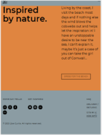
3. (Tablet-Footer) Increase text width?
That would be great, thanks @tuanphan!
-
@bunj Did you ever figure this out? I'm also suffering with the same issue.
Thanks
-
-
@tuanphan worked perfectly, thanks!


Slideshow full width on all devices
in Images & Videos
Posted
I can't seem to figure out how to get the slideshow on the homepage of www.elasticdance.com to take up 100% of the width of the page. If I set the slideshow to "full", it cuts off the heads of some of the images. But if I set it to "simple", I can't get it to take up the full width of the screen.
I've tried various options found on the forum, but none of them seem to work.
Thanks!