
casafloralia
-
Posts
20 -
Joined
-
Last visited
Content Type
Forums
Gallery
Blogs
Events
Store
Downloads
Profiles
Posts posted by casafloralia
-
-
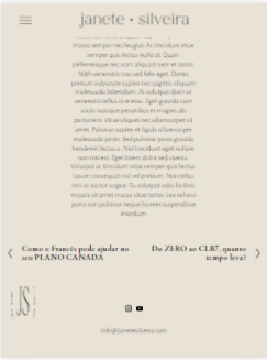
On 5/19/2021 at 6:09 PM, casafloralia said:
hey everyone,
I'm trying to make the section with the title (green background) sticky to the left, while scrolling the section with the text (nude background) to the right.
can anyone help?
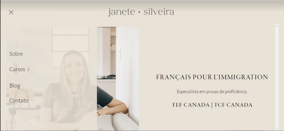
https://janetesilveira.squarespace.com/depoimentos-clb7
ps: 1234
hey @tuanphan would you be able to help? 🙂
-
hey everyone,
I'm trying to make the section with the title (green background) sticky to the left, while scrolling the section with the text (nude background) to the right.
can anyone help?
https://janetesilveira.squarespace.com/depoimentos-clb7
ps: 1234
-
I'm still struggling to maintain the header logo centered on all devices.
I guess it has something to do with the hamburguer menu.
-
3 hours ago, tuanphan said:
Add to Design > Custom CSS
/* remove scroll bar on burger desktop */
@media screen and (min-width:992px) {
.header-menu-nav-folder--active {
    overflow: hidden;
}
}
/* tablet */
@media screen and (min-width:768px) and (max-width:992px) {
/* center footer logo */
div#page-section-608ffe74d1bf763c75618aca>.row>.col {
    margin: 0 auto;
    width: 100%;
}
/* reduce space */
[data-section-id="6091547b96145d3ee02ae3e6"] {
    min-height: unset !important;
}
/* increase blog width */
.blog-item-inner-wrapper {
    width: 90% !important;
}
}
Thank you @tuanphan!
The footer logo on tablet is centered but it is way too big.
-
On 5/5/2021 at 8:34 PM, tuanphan said:
And I also found some problems. You can create new questions, we will help easier
Site URL – https://janetesilveira.squarespace.com/
1. (Desktop-Header) Remove right scroll?

2. (Tablet-Footer) center logo?
3. (Tablet-Homepage) reduce this space?
4. (Mobile-Blog) Add a space between image – read more?
5. (Tablet-Blog posts) Increase post width?
Hi @tuanphan!
Yes! I'd like hep with all that 🙂
-
On 5/6/2021 at 5:03 AM, tuanphan said:
Hi. The logo looks center here. Did you solve the problem?
Hi @tuanphan!
Thanks for replying.
No, It looks like it's in center but it's not, specially when the screen is a little smaller than desktop.
-
hey everyone,
I'm trying to keep the hamburger menu on desktop.
I've managed to do it, but can't seem to get my logo in the center.
can anyone help?
here's what I've done so far:
@media screen and (max-width: 5000px) {
  /* Display burger icon at all widths*/
  .header .header-burger {
    display: flex;
  }
  /* Make burger menu visible at all widths */
  .header--menu-open .header-menu {
    opacity: 1;
    visibility: visible;
  }
  /* Hide primary navigation menu */
  .header .header-title-nav-wrapper .header-nav {
    display: none;
  }
  /* burger position */
.header-display-desktop {
    flex-direction: row-reverse;
}
}
https://janetesilveira.squarespace.com/
ps: 1234
-
hey everyone,
I'm also trying to keep the hamburger menu on desktop.
I've managed to do it, but can't seem to get my logo in the center.
can anyone help?
here's what I've done so far:
@media screen and (max-width: 5000px) {
  /* Display burger icon at all widths*/
  .header .header-burger {
    display: flex;
  }
  /* Make burger menu visible at all widths */
  .header--menu-open .header-menu {
    opacity: 1;
    visibility: visible;
  }
  /* Hide primary navigation menu */
  .header .header-title-nav-wrapper .header-nav {
    display: none;
  }
  /* burger position */
.header-display-desktop {
    flex-direction: row-reverse;
}
}
https://janetesilveira.squarespace.com/
ps: 1234
-
Site URL: https://casafloraliaa.squarespace.com
ps: studio
hi everyone, I'd like to have the hover:background portfolio layout on desktop, and the grid: simple on mobile with text alignment to the center.
Is that possible?
-
hi @tuanphan!
I'm trying to do the same thing, I'd like to have the hover:background portfolio layout on desktop, and the grid: simple on mobile.
Is that possible?


Split Sticky Sections
in Customize with code
Posted
hi @tuanphan thanks for replying.
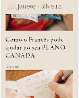
the one with the title "Do ZERO ao CLB7"
i'd like that one to be sticky to the left, while the other section with the text can scroll to the right.